
4 Ways to Stop Annoying Your Website Visitors
Imagine this. You find the right product on a website and every time you scroll down or click on another page, an ad pops up? Or maybe you've been scrolling for a while and then suddenly a video starts playing.
Or, my personal pet peeve, a full page pop up with a non existent or teeny tiny x that you can never find or click on with your finger. This can be super annoying—and your site visitor might never come back again! But there are ways to stop this from happening. Here are four tips to stop annoying your website visitors.
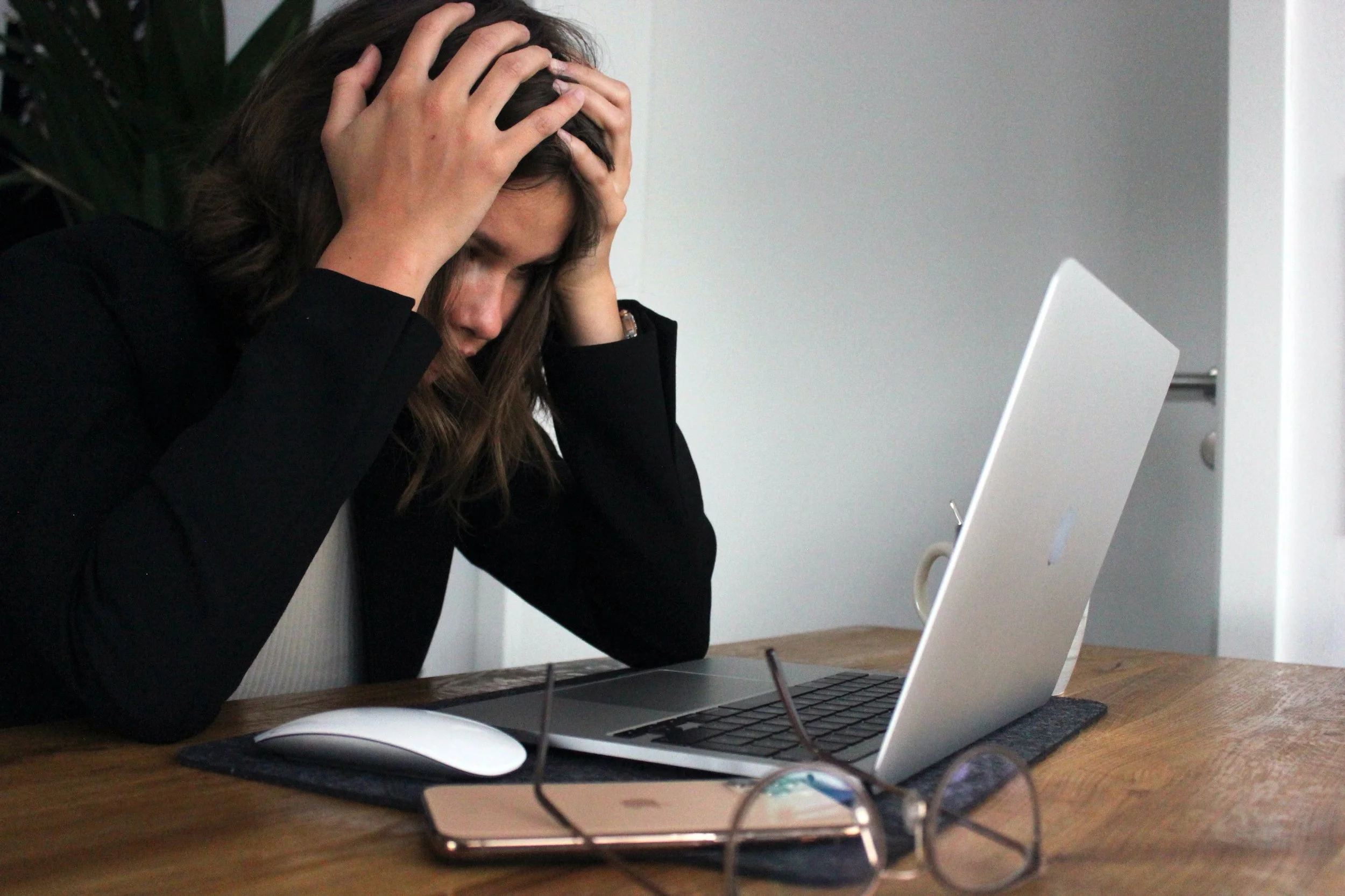
Photo by Elisa Ventur on Unsplash
Reduce or get rid of pop-ups
We already touched on the dreaded pop-up. It used to be the first sign that you landed on a spammy or unsafe website by getting waves of pop-ups that seemed never ending.
You don't want to annoy your website visitors, so you should try to avoid using pop-ups whenever possible. As a general rule of thumb they shouldn’t appear immediately or be hard to get rid of.
Make it easy for people to dismiss or X out of them. Make sense, right? They're annoying under the best circumstances and not always effective. Instead of a pop-up, consider using another strategy that is more effective and less annoying.
A contact page or form where you can collect information from people who visit your site (for example, if they want to sign up for your newsletter or list). This way, they know what they're getting into before they sign up--and it gives them more control over their experience than just clicking the X when presented with an unexpected popup!
Increase your site load speed
How many times have you left a website that didn’t load in 10 seconds? My virtual hand is also up! People don’t have the patience to wait for your site to load. They are busy and will never know about your business if the website is slow and sluggish.
The website speed is very important. It can help to increase the conversion rate of your site and decrease the bounce rate. There are many things you can do to make sure that your site loads quickly.
Reduce the size of your images. This is easy to do with an online compression tool like squoosh, which I use and love. Learn more about how to optimize and upload images on your website.
Choose the right hosting and web design platform for you. Using Squarespace makes it easy to combine all these website necessities in one place so I don’t need to worry about loading speeds with a cheaper but not as fast hosting company.
Make your above the fold content load faster. Above the fold means the part of your site visible before someone starts scrolling. If you have a lot of pictures on your homepage for example make sure people can read the main message of your website before having to wait for your other images to load.
Use simple and clear words
This was a hard one for me to learn because I loved using fancy and complex words other people didn’t always know. I genuinely confused some customers when working retail by saying our size selection for some denim was sporadic at best. They looked at me like I’d grown two heads!
Don't use jargon or industry specific words. If you're talking about a product, don't use the word "widget" unless your audience is familiar with it. In general, try to keep things simple and easy to understand by using language that everyone can relate to--not just those in your industry or niche. For any word people might not know make sure to explain it.
Don't use acronyms unless your audience is familiar with them (e.g., do not assume everyone knows what SEO stands for). This means not only avoiding jargon but also being careful when using acronyms like SEO (search engine optimization), SMO (social media optimization), CTA (call-to-action), etc., because these may mean different things depending on who you're talking too!
Show relevant content to users.
If someone lands on your About page don’t start doing a deep dive on your products, packages and services. That’s not what the About page is for! There should be a strategy and specific goals for each one of your pages. It seems simple but when creating your website from scratch keeping track of all your content and pages can get confusing.
This is why when I design a website I make sure that all the content is created or organized if we aren’t using filler content like lorem ipsum for the text. It takes longer to plan out your web pages in advance but it’s so much easier to stay organized that way.
You can think of your homepage or landing page as the jumping off point for people to find what they are looking for on your site. Having different sections that link to the relevant pages of your website makes it easy for the user to navigate your site.
Make sure your content is easy to find and doesn't require them to search for it, like by having an "About Us" page that links directly back up through your navigation bar on every other page of your site (for example).
Stop annoying your website visitor by doing these things
Be patient with your user. Don't make them wait for the page to load, or add extra steps just for the sake of it.
Be clear about what you want them to do. Make sure that every button and form field is clear in its purpose, so they know exactly where they're going when they click something on your site or fill out a form.
Be consistent in your design (and make sure all the links look like links). If there's an icon next to an image on one page but not another, it'll throw people off and make them think that maybe something's broken on their browser--and then maybe they won't come back!
I hope this article has helped you better understand how to stop annoying your website visitor. Make sure to check out my VIP days and packages if you’re ready to hand off keeping up with tech and upgrade your online presence.